Monday, October 31, 2016

project 03 :: project statement

Since publications were extremely popular among the works produced by Futurists, I will create the "Destruction of Syntax–Imagination without Strings–Words-in-Freedom" manifesto by Marinetti into a publication featuring the classic Futurist look of words-in-freedom.

However, to bring the ideals of Futurism into a contemporary context, I will make this a digital, interactive publication. From my research I gathered that the Futurists champion speed, movement, and technology. But the technology they were so excited about included the telegraph and the newspaper – now we have e-books, smart phones, and the Internet! They would get so excited! Back then they wanted to defy the norms of printing and traditional layouts – that's how they got "words-in-freedom" – but they were constrained by the printing technologies of the day. Now, I can take their ideas even further by not even using a traditional paper book.

Using InDesign to create an animated, interactive words-in-freedom publication that will be distributed on the Internet, I will highlight the Futurist ideals of speed, movement, technology and expressive type in a contemporary context. 

Monday, October 24, 2016

project 03 :: further research

Some more helpful websites about publications from Italian Futurism :: 


More images of Italian Futurism publications ::


Interesting snippet from this page that has inspired my current ideas ::


If Futurism was about rejecting the "traditional past of book design" while championing technology, speed, and motion, how can I continue that idea by using the technology available to me now?
My idea: an e-book. I'm going to look into presenting the manifesto in an interactive e-book complete with some animations, sounds, and words-in-freedom.

How-to websites ::


Saturday, October 15, 2016

project 03 :: futurism research

Some iconic pieces of futurist artwork ::


Umberto Boccioni, Unique Forms of Community in Space, 1913

Umberto Boccioni, Elasticity (Eliasticitá), 1912, oil on canvas, 100x100cm 

Giacomo Balla, Dinamisno di un Cane al Guinzaglio (Dynamism of a Dog on a Leash), 1912

Umberto Boccioni, sketch of The City Rises, 1910

Giacomo Balla, Abstract Speed + Sound, 1913-1914
Examples of Futurist typography/words-in-freedom ::


Examples of contemporary interpretations of words-in-freedom ::


Screenshot from Google search that exemplifies "movement" of the movement ::


Fonts used at the time of Futurism :: 

  • Futura 
  • Kabel
  • Thunderbird
  • Bauhaus
  • Bank Gothic
  • Goudy
  • Didot
  • Bernhard
  • Hobo
  • Souvenir
  • Rodchenko
  • Eagle
  • Trade
  • Franklin Gothic
  • Perpetua
  • City


Other concepts to keep in mind ::
  • speed
  • technology
  • nationalism
  • all kinds of mediums
  • "the perceived world is in constant movement"
  • colors :: red, yellow, green, blue
  • "artistic work without an aggressive element cannot be considered art"
  • language without syntax to convey emotion; expressive typography 
Helpful links ::

About/Background Info

Words-In-Freedom 

Interesting reads 


Thursday, October 13, 2016

project 03 :: manifestos galore

To choose an "ism" as the basis for my project, I looked over the manifestos.

Dada is fascinating to me, and in reading the first few sentences of the manifesto, I thought it would be quite a fun challenge to work with that text. However, due to the sheer length of the manifesto and absolute absurdity of the words (intentionally so, of course) I decided to take a look at other options.

While reading "Destruction of Syntax–Imagination without strings–Words-in-Freedom" by F.T. Marinetti from The Futurist Sensibility, I was captivated by how so many of the ideas Marinetti expresses are applicable in contemporary society:

"The earth has shrunk by speed..."
I think this is even more so the case today.

"Today he is aware of the whole world..."
We can know what is happening around the world with the click of a button... and we can "be" somewhere via technologies like Skype, FaceTime, live streaming video, or Google Maps. And Marinetti was talking about newspapers, locomotives, and the telegraph! What would he think if he were alive today, in the era of the Internet and smartphones?!

"He little needs to know what his ancestors did, but he must assiduously discover what his contemporaries are doing all over the world..." 
How much more today have we forsaken tradition and history to be consumed with ourselves and the present?
_ _ _ _ _

Apart from these ideas about speed and technology, I was struck by these principles:
– letting typography SHOW what you MEAN
– "I oppose the decorative, precious aesthetic of Mallarmé and his search for the rare word, that one indispensable, elegant, suggestive, exquisite adjective. I do not want to suggest an idea or a sensation with passéist airs and graces. Instead I want to grasp them brutally and hurl them in the reader's face."
– words in freedom

_ _ _ _ _

As I move forward with my research of futurism, I'll be thinking about how I can incorporate speed, movement, technology, and words-in-freedom in my design to show the intrinsic nature of futurism and how it has influenced typography and graphic design.

Wednesday, October 12, 2016

project 03 :: reading response

The selection from Pioneers of Modern Typography by Herbert Spencer was a fascinating read that walked through the Futurism, Suprematism, Dadaism, De Stijl, and Bauhaus movements and acknowledged their roots in Cubism. I appreciated how the author pointed out the culture of printing in the years before these movements emerged. In the 1870s until the 1910s, printing was primarily for artistic and elite purposes with elaborate ornamentation. With these new movements, printing was reclaimed as a means of conveying ideas and information that was less removed from the realities of contemporary society.

I also found it interesting to see how much of our modern graphic design principles and tendencies, such as asymmetry, contrast, color as a design element, and sans-serif typefaces, were developed in the period of time when these movements emerged.

It was cool to be able to see how the movements inspired and spurred one another on, whether because the principles were adopted or because they were changed to match a different agenda. There are lots of formal and conceptual similarities and differences. For example, Dadaist and Futurist work looks very similar, but the Dada movement came out of disillusionment with war and a revolt "against the establishment," so to speak. The Futurists also wanted to break with the past, but they were much more nationalistic. While Dadaists saw war and all the ideas that led to it absurd, Futurists championed speed and technology and saw war as cleansing. I find these two movements most fascinating; I'll probably choose between the two as I move forward in my research.


Tuesday, October 11, 2016

Project 02a :: Final book layout proposal & synopsis


It is exciting to be working on a project that so many people are collaborating on. 

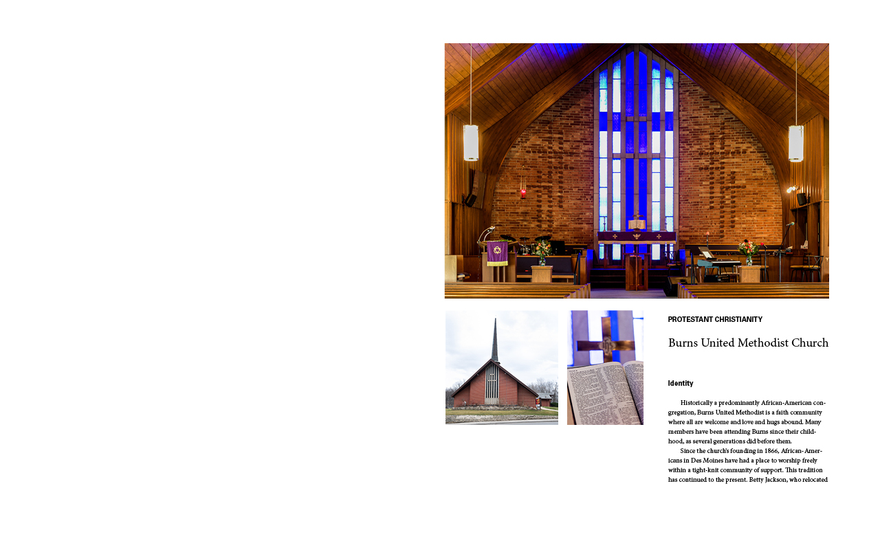
As one of the designers, the conceptual development of the page layout I created began with listening to the vision of our client (The Comparison Project and Drake Community Press) and looking at the content they provided. We learned that our client wants to see text and image integrated and treated with equal importance, rather than photos slapped in to illustrate the text. We also knew that they wanted a large format book. So, I used the height and width of the images to find the ratio I used to define my page format, which turned out to be 9"x11.25". I spent a lot of time working on the grid system – figuring out columns, margins, leading, and such. I wanted the text and images to have breathing room, but I also didn't want to have a whole lot of white space. I ended up keeping the text in 2 columns with ample leading, and allowed the images to push through the boundaries of the grid. 

As we begin to develop the book as a whole, I think incorporating color into the headings or other design elements would be a good way to keep each of the 15 sections unique while unifying the book overall. We could pull one color from the photographs from each of the 15 sections for the unique distinguishing aspect, but apply the color to the same places/text/design elements in each section for more cohesion. The 15 colors should also work well together as a palette – be "of the same mind" in terms of tint/shade/vibrancy.

Wednesday, October 5, 2016

project 02a :: section layout for critique

Page format :: 9 x 11.25"
2-column grid
Margins :: top & inside 0.75in, bottom 1.5in, outside 1.25in
Gutter :: 0.5in
Fonts :: Univers LT Std & Adobe Caslon Pro