Friday, September 30, 2016

project 01 :: final poster design

Since I liked the color-block and glyph pattern design on the cover of my booklet so much, I decided to scrap my previous poster and use an updated version of my cover design instead.

previous working version

updated solution


Although I liked the dynamic diagonal lines in the poster I had been previously working with, I think the vibrant colors and simultaneous order & spontaneity of the color block design represents the typeface "Montserrat" more effectively. When I researched the streets of Montserrat, Buenos Aires, I was surprised to find that the grid system of the city streets was relatively ordered. The color blocks help portray this. The vibrant culture of that city, though, is far from boring, and this is represented through the glyph patterns that break outside of the bounds & overlap other elements, as well as the bright colors that are not compromised by a reduced opacity.

The choice to change my design also creates more cohesion between the booklet and poster. I did not use many muted colors in my booklet, while that was the direction I was previously going in for my poster. Rather than create texture through opacity and layering, I created texture through layering of bright colors and glyph patterns.

Thursday, September 29, 2016

project 01 :: final booklet layout

After some experimenting, I created a grid system based on 3 columns and 6 rows that could also support a 2- and 4-column option.


2-column (blue guides)

3-column

4-column (blue guides)
Once I created this underlying structure, it was so much easier to make my design more cohesive. The grid system also inspired me to completely redesign the cover, using color blocks and pattens made of glyphs from the typeface. As I laid out my content within the grid system, I incorporated that color-block and glyph-pattern look from the cover throughout the booklet.

I found that the content of my pages fell into 4 themes: letterforms, extended glyphs, body copy, and display text, so I interspersed these pages to make the viewing more dynamic. I also added a small gray page heading on the top left of each spread to act as a consistent "signpost" throughout the booklet that lets the viewer know what kind of content he or she is looking at.


project 02a :: research

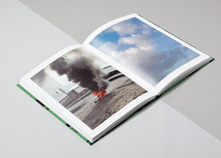
In researching photo narrative books, I found some with only images, some with large images and minimal text, and some with relatively equal amounts of images and text. Here are some examples of what I found.

Images only ::


Images with minimal text ::


Images with large amounts of text ::


Thursday, September 22, 2016

project 01 :: critique #2 reflection

On Tuesday we printed out our preliminary booklets, looked at them together and gained both inspiration and helpful criticism from each other. I realized -- much to my chagrin -- I had set up my document with the wrong dimensions. This worked out in my favor, though, because I still needed to set up a solid grid system and as I moved forward I found it much easier to work with the correct dimensions as specified for this project.

I came away from the critique with a much clearer idea of what to include in my booklet and how to go about making Montserrat look its best.

Going forward I will continue working on my grid system. I will also think about which aspects of the typeface would be beneficial to compare and which aspects would be important to emphasize. I will continue with the color-blocking and glyph-pattern theme that developed on my cover, but I will make it more intentional and incorporate it throughout the entire book. I will also incorporate it into my poster.

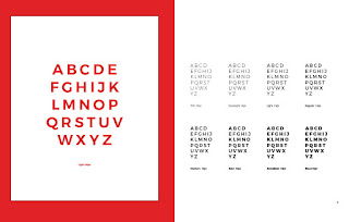
preliminary booklet spread

I like the layout of these glyphs

emphasizing the display faces

color blocking & glyph patterns on the cover

poster iterations side-by-side

developing a more solid grid system